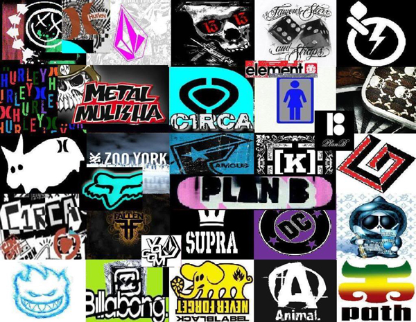
Branding is as important in the skate world as it is in music gear or automotive tools. Whenever high-quality personal tools of the trade are brought to the market for sophisticated consumers to lust after, image is the magic ingredient that combines a manufacturer’s name with word-of-mouth endorsements that build the base of any company’s success.

Skateboard riders are a particularly loyal bunch, plastering favored makes on board and bodies alike. There is no end to the free advertisement an equipment manufacturer can expect to get, not only on the boards themselves, but on clothing, shoes, tattoos, stickers scattered at popular urban obstacle courses-and of course graffiti.

The logos plastered to a deck say as much about the personality of the skater as the characteristics of the board. While many noobs follow the endorsement of a celebrity skater in choosing their brand, most follow the picture that matches the self-image and style the skater is striving after.
Skateboard logos have become an art form of identification. The dominant style is grainy and raw, often black and white and tending toward a hand-drawn appearance, like the popular etnies and Darkstar marks, although a growing subgenre uses tight, often psychedelic fonts to match exotic-sounding brands, such as Osiris and Satori, or a neat, clean cut look like Burton or Adio favored by straight-edgers.
The outlaw mentality of skateboard culture is reflected in many logo designs. Others integrate common icons, like the Goth Iron Cross used by Independent and Flip, that connect the skater with various subcultures related to music and general outlook on life. Other logos using the art and script associated with punk, heavy metal, house music and rap are displayed by the fans of those music genres who skate.
The overwhelming tone of skateboard logos reflects an aggressive, “kick-ass” approach to life appropriate to the risk-takers and daredevils using the equipment. Riding a board also takes a good sense of humor to shake off the days bruises, and plenty of brands tend toward the outrageously comical, such as the evil flaming grin of Spitfire, Maple, and World Industries logos, appealing to the wry wit usual among streetwise skateboarding enthusiasts.
Many top skate logo designs, like Black Label, DC Shoe and ZERO, generally tend toward hard edges and sharp corners, much like the urban geography where guerilla athletes play, often with a splatter-paint effect reminiscent of another prime urban pastime: tagging. Still others, like Billabong and QuickSilver, express the surfer-roots of riding a board.
Naturally, a hardcore of purists rage against all this commercialism, claiming with considerable justice that becoming moving billboards for skate equipment firms is as counter to the spirit of independent extreme sport as pimping for Pepsi or McDonalds.
Nevertheless, the trend is to kick such old-school attitudes to the curb. Today and as far as the eye can see, the majority of decks will continue to bear signs of the proud allegiance and fierce loyalty evoked by skateboarding logos among their brands’ fledgling as well as experienced users.


Facebook
Twitter
RSS